 |
| FIRST LAYOUT WITHOUT IMAGE |
On my first layout, I have
tried out a template without using any images. This is because it would give me
a rough idea of where I should place the coverlines and other conventions on
the front page.
 |
| SECOND DRAFT |
For my second try, I have included my main image. During this stage, I have
changed the background from grey to a navy blue colour. This is because I think
it would suit better to the image as it enlightens my model and also makes the
coverlines stand out more in comparison to a plain grey background. At this
stage, I think that the coverlines is quite distracting from the model’s face
which may seem unprofessional. In order to avoid this, I have positioned my
coverlines to avoid the model’s face. I also think that my coverlines are quite
visible and distinguishable from each other.
 |
| FINAL RESULT |
I have changed some of the text colour because I would like
my coverlines to stand out more. I also moved the barcode to the right hand
side due to the fact that it would previous in the way of my model’s arm. In
addition, I have edited the effect of the background so it would make the background
less’ boring’ and more interesting so that the audience wouldn’t be looking at
a plain background.
 |
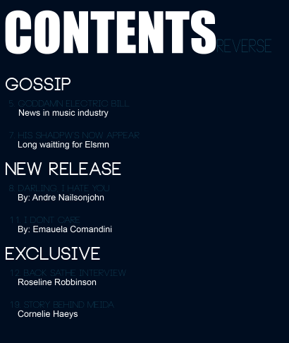
| FIRST DRAFT |
Again, on my first draft of my contents page, I have firstly
tried to arrange the text first, then the images. I have used a similar colour
scheme to make the front cover and contents page link together. Furthermore, I
think that the font of the contents is too thin and I cannot read it very well.
 |
| FINAL PRODUCT |
For my final product, I have changed the colour of the text
and added pictures on the right hand side of my contents page instead of one
big main image. I’ve also re-located ‘Contents’ to the top left hand corner as
it is more visible and distinguishable by the audience.

No comments:
Post a Comment