Friday, 25 April 2014

Audience Portfolio


Name: Meddie
Age: 17
Social Group: Young Adult
Hobbies/ Interest:
-Reading
-Going outdoors
-Listening to music
What music genre do you listen to?
- Hip hop
- Indie
- Rock
- R&B
' I like to listen to all type of music'
What magazine you are interest at the moment?
-Sport magazine


Name: Kati
Age: 18
Social Group: Young Adult
Hobbies/ Interests:
-Sleeping
-Listening to music
-Editing photos
What music genre do you listen to?
-R&B
-Pop
-Rock  
 What magazine you are interest at the moment?
- Q and NME
 

Name: Chalack
Age: 18
Social Group: Young Adult
Hobbies/ Interests:
- Revising
-Listening to music
- Going out
What music genre do you listen to?
-Funky
- R&B
- Pop Rock
What magazine you are interest at the moment?
- Don't read magazine

 
Name: Zhen
Age: 18
Social Group: Young Adult
Hobbies/ Interests:
-Listening to music
- Going out
What music genre do you listen to?
- Rock/ indie
What magazine you are interest at the moment?
- Q-NME 
 
Name: James
Age: 17
Social Group: Young Adult
Hobbies/ Interests:
-Listening to music
- Going out
What music genre do you listen to?
- Rock
-Rap
-Hip Hop
What magazine you are interest at the moment?
- Sport magazine
 
Name: Ernie
Age: 18
Social Group: Young Adult
Hobbies/ Interests:
- Taking Photographs
- Going out
-Listening to music  
-Keeping up with news
What music genre do you listen to?
- Jazz
-Rock/Indie
What magazine you are interest at the moment?
- Photography magazine
-NME
 
From looking at my audience portfolio, I found out that there are equal popularity for both of the gender. However, a lot of women are tend to read a music magazine more than men. This is because woman are more aware in elements of social life, such as fashion magazine or update on their favourite celebrities/ artist. Thus to engaging the male audiences, I will have to use the colour scheme or images to capture their attention.
 
The social group is also important to my music magazine because it will be easier to make a product that will best suit to their personality and lifestyle. By knowing their lifestyle it will attract the reader better than without knowing the audience; this therefore will create more revenue due to the magazine will meet the demand of the customer (if we were have distribute this is real life). 
 

Tuesday, 1 April 2014

PHOTOSHOP MOCK UP

FIRST LAYOUT WITHOUT IMAGE

On my first layout, I have tried out a template without using any images. This is because it would give me a rough idea of where I should place the coverlines and other conventions on the front page.


SECOND DRAFT 

For my second try, I have included my main image. During this stage, I have changed the background from grey to a navy blue colour. This is because I think it would suit better to the image as it enlightens my model and also makes the coverlines stand out more in comparison to a plain grey background. At this stage, I think that the coverlines is quite distracting from the model’s face which may seem unprofessional. In order to avoid this, I have positioned my coverlines to avoid the model’s face. I also think that my coverlines are quite visible and distinguishable from each other.
FINAL RESULT
I have changed some of the text colour because I would like my coverlines to stand out more. I also moved the barcode to the right hand side due to the fact that it would previous in the way of my model’s arm. In addition, I have edited the effect of the background so it would make the background less’ boring’ and more interesting so that the audience wouldn’t be looking at a plain background.
FIRST DRAFT


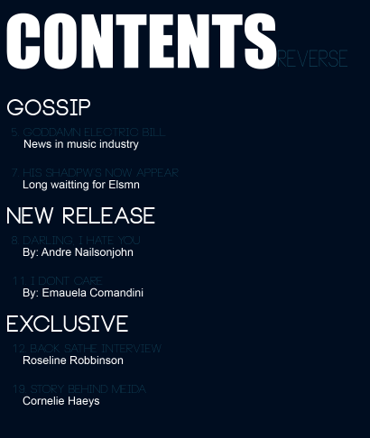
Again, on my first draft of my contents page, I have firstly tried to arrange the text first, then the images. I have used a similar colour scheme to make the front cover and contents page link together. Furthermore, I think that the font of the contents is too thin and I cannot read it very well.

FINAL PRODUCT
For my final product, I have changed the colour of the text and added pictures on the right hand side of my contents page instead of one big main image. I’ve also re-located ‘Contents’ to the top left hand corner as it is more visible and distinguishable by the audience.


Thursday, 27 February 2014

Pictures


*These photos above are for my front cover music magazine. 
For the 1st photo, the model, It isn’t very conventional as the image is blurred ever so slightly around the face which is not suitable for a magazine in general. Also, the model isn’t posing in such a way that promotes the music magazine.


For the 2nd photo, I slightly liked this due to the fact that it is a medium shot as the model is looking directly at the at the camera as it engages with the audience.


For the 3rd photo, this is a very blurry shot which is again, not suitable for a magazine in general. 


For the 4th photo, I also think is not very suitable as the model is facing down and not directly into the camera as it does not create empathy, thus not attracting the audience as much as I would like to.


Overall, I think I would be using the 2nd photo as this photo has fewer mistakes in comparison to the other photos that I have taken. Moreover, since this photo was a medium shot, it displays similarities to what a professional music magazine’s main image is presented.
For the first photo, I will not be using this because it is too dark therefore the audience would not be able to see her face. To add to this, the model’s face is covered. This would not be suitable for the double page spread as it lacks detail and expression from the model and the photo taken itself is slightly blurry.

For the second photo, I would not be using this photo because the model is facing downwards. This will not engage with the audience. However, I like this photo because it gives a sense of peacefulness as you can tell by her body language and positioning.

For the third photo, the photo is ever so slightly dark but can be changed easily by using Photoshop.
For the fourth photo, I like this photo as the guitar (prop) is placed next to her but her facial expression was quite emotionless.

For the fifth photo, again the facial expression seems slightly depressed even though the model is looking directly at the camera.


Overall, I will be choosing photo three because the facial expression is quite ‘happy’ and her body language is positioned in a way that she is in love with music as she is ‘playing’ the guitar. However, I can easily change the brightness and contrast of the photo as it would make the photo more presentable.


For this photograph, I have increased the brightness and contrast, especially around the head area because the original photo was slightly dark which may lead to unprofessionalism. I have also deleted the background of the photo as I want a plain background which looks more ‘classy’ and sophisticated. I have also edited the model's make-up on Photoshop. This is because it would bring out her facial features and would attract my target audience of my music magazine.


For the main image of my font cover, I did quite a lot. For instance background, colour balance, brightness and contrast and SFX. 

The background of my from cover, I have changed from purple background to dark blue. This is because from my research (mood board), a famous rock music magazines are tend to use blue to present there genre.

The colour balance and the brightness are also used to edit my photograph due to the original image is quite dark around the face, which will give an unprofessional look. So I have make the face brighter whereas the rest of the body stay the same. By making the model face brighter, it will bring the facial expression of the model better thus will capture the reader's attention.

Furthermore, the SFX is added around the left arm of the model. This is because I don't want it to look too plain at the bottom left corner when it comes to the construction part. By adding the SFX into the music magazine is challenging the convention due to they are more in a sci-fi genre than in a music magazine. This perhaps will draw the reader attention to buy a magazine.